Why looking at exponential curves tells us nothing, or almost nothing…
Spectacular curves and figures are used to report on the Covid-19 pandemic situation
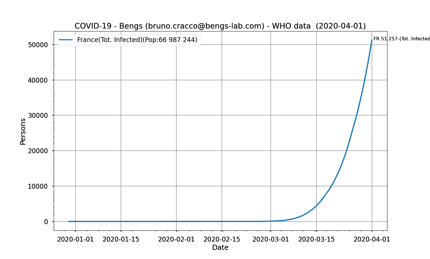
Fig. 1: number of positive cases tested in France as a function of date
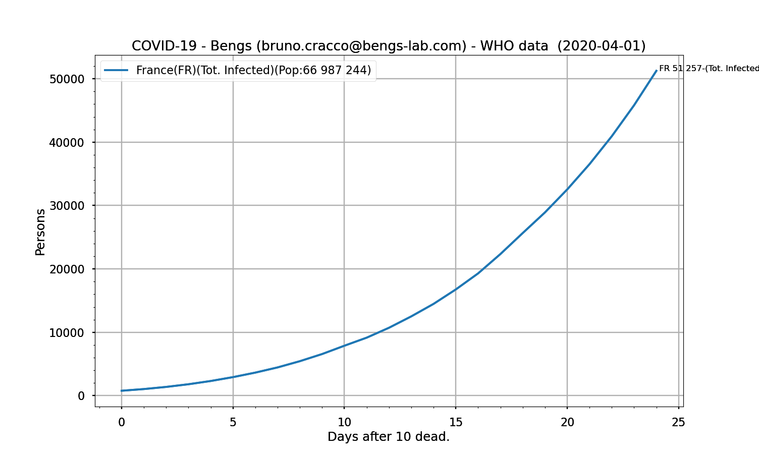
Fig. 1.1: number of positive cases tested in France as a function of the number of days after the 10th death
Deaths follow an equally impressive and proportional curve (which indirectly reflects the mortality rate)
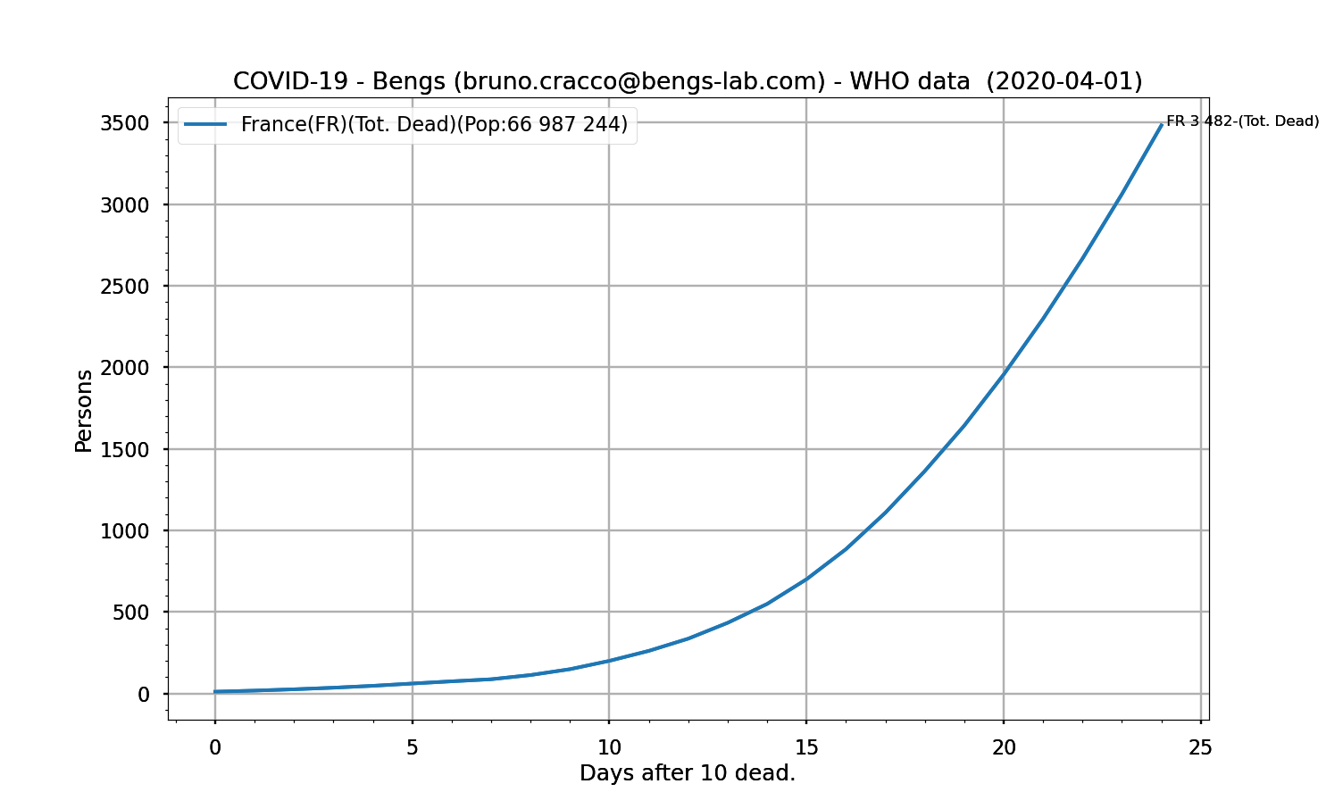
Fig. 2: Deaths in France as a function of the number of days after the 10th death
Our brains are helpless in the face of an exponential curve.
It’s going up, vertically or almost vertically, and that’s all we can see.
Unequal situations in different areas and countries
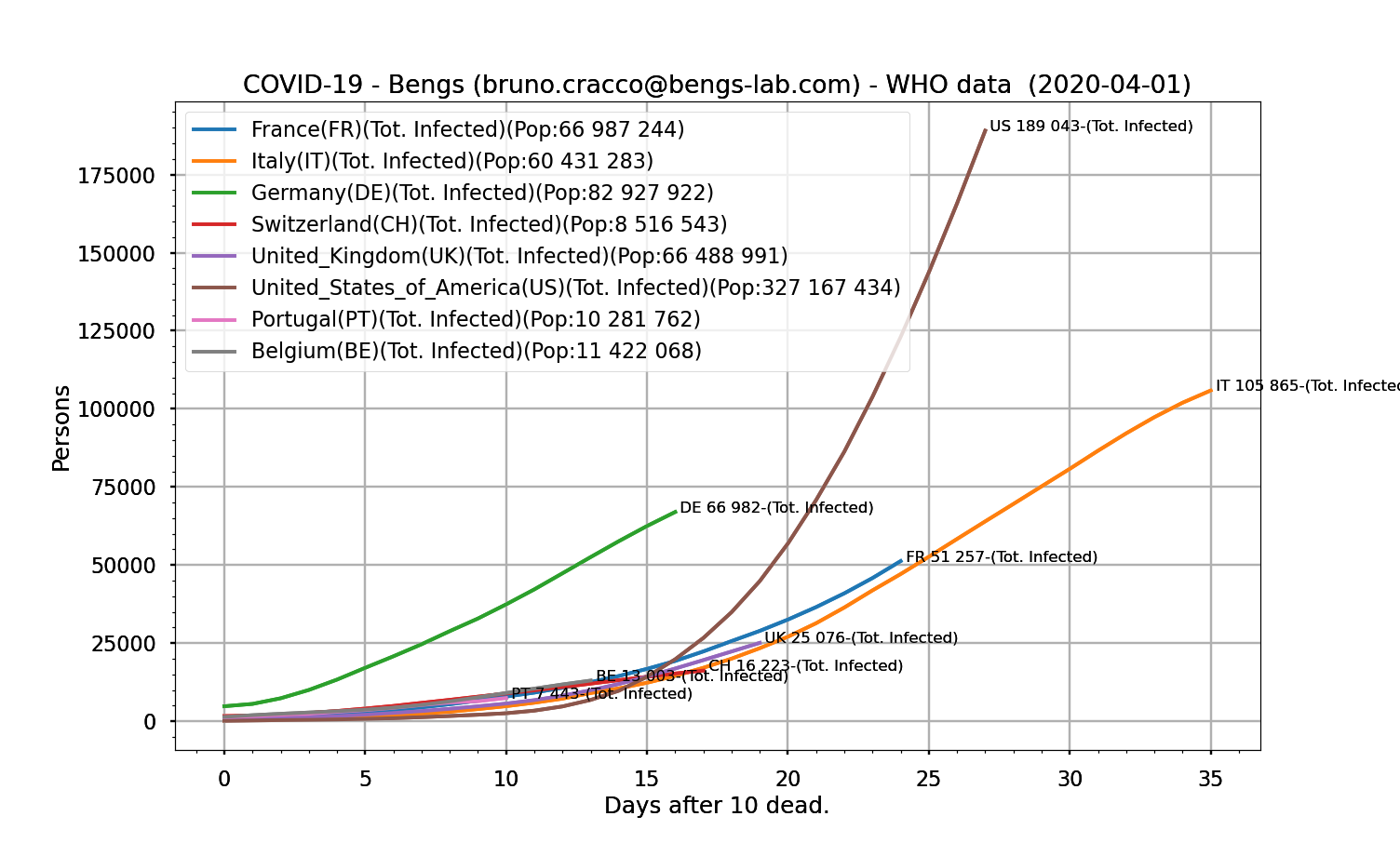

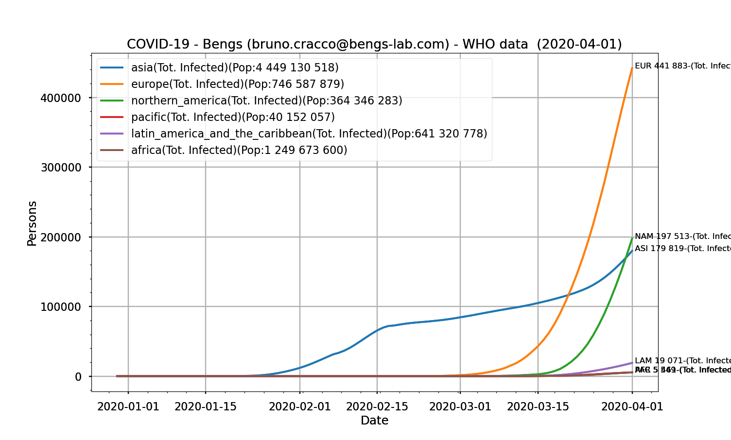
Fig. 4: Curves for the 6 major regions of the number of people testing positive as a function of date
Asia starts in January 2020, followed by Europe, which is growing much more impressively than Asia (but the figures given by China are questionable today, we will come back to this later), then North America, which is starting as strong as Europe, at the same time as Africa (which is starting slowly), followed by South America and the Pacific, which are only just beginning.
Is it related to the size of the country? Does reporting the contagion figures to the country’s population tell us more?
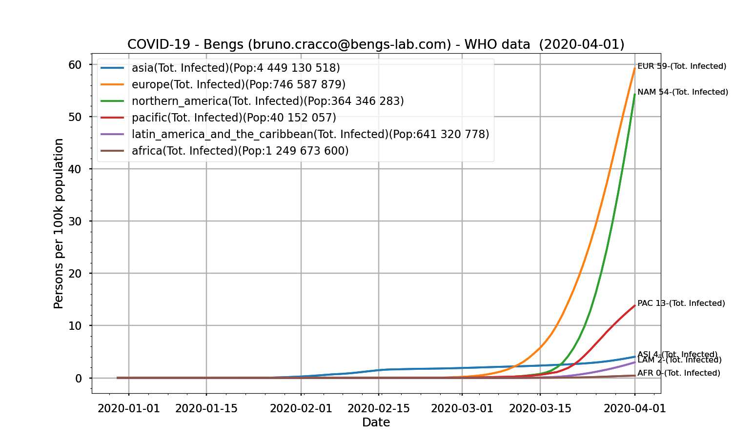
Fig. 5: curves for the 6 major regions of the number of people testing positive per 100,000 people in the population of the area as a function of date
Actually, yes and no. There’s an epidemic spreading from person to person. It is therefore the size of the source of infection and especially the extent of its borders that determines its ability to grow more or less rapidly. And it is rather the mobility of contagious individuals that accelerates or reduces its speed of spread. A contagious individual creates a source of infection around him. If he or she is parachuted into the midst of a healthy population, he or she will create a new exponential outbreak of contamination. Hence the measures of containment and restriction of mobility that prevent a generalized flare-up of the disease in the population.
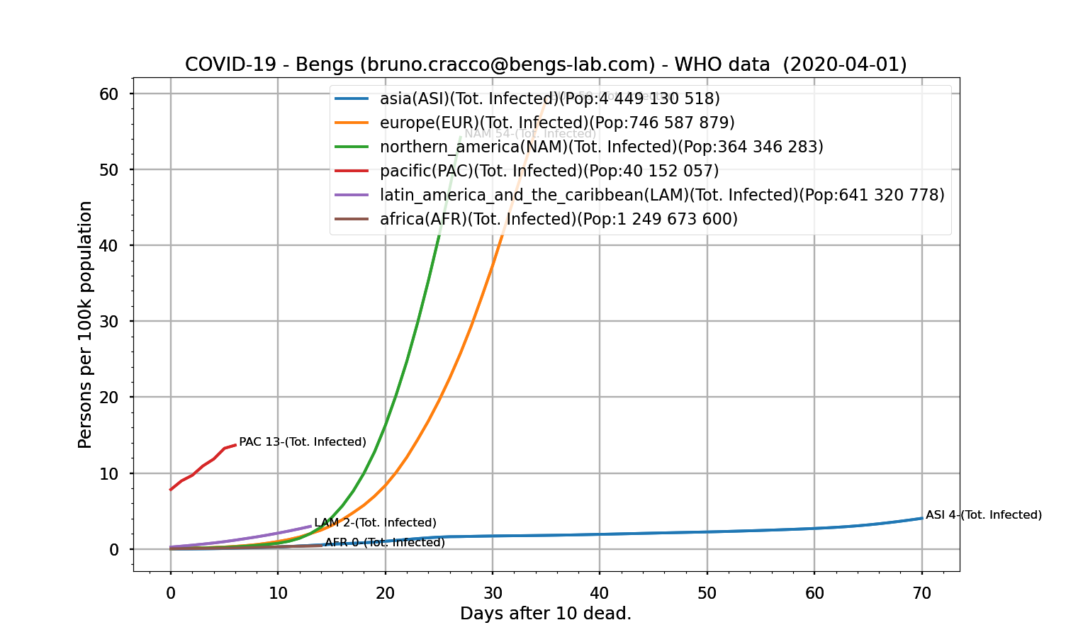
Fig. 6 : curves for the 6 major regions of the number of people testing positive per 100,000 people in the population of the zone as a function of the number of days since the 10th death.
It can be seen that North America is experiencing a much faster growth in cases than Europe, which was impressive compared to Asia. This is best illustrated in the following figure where the patterns are expressed in days after the 10th death.
So what ? Are we winning the war or are we far from it ?
One could say that one has to observe the number of new cases detected day after day to assess whether one is winning the war.
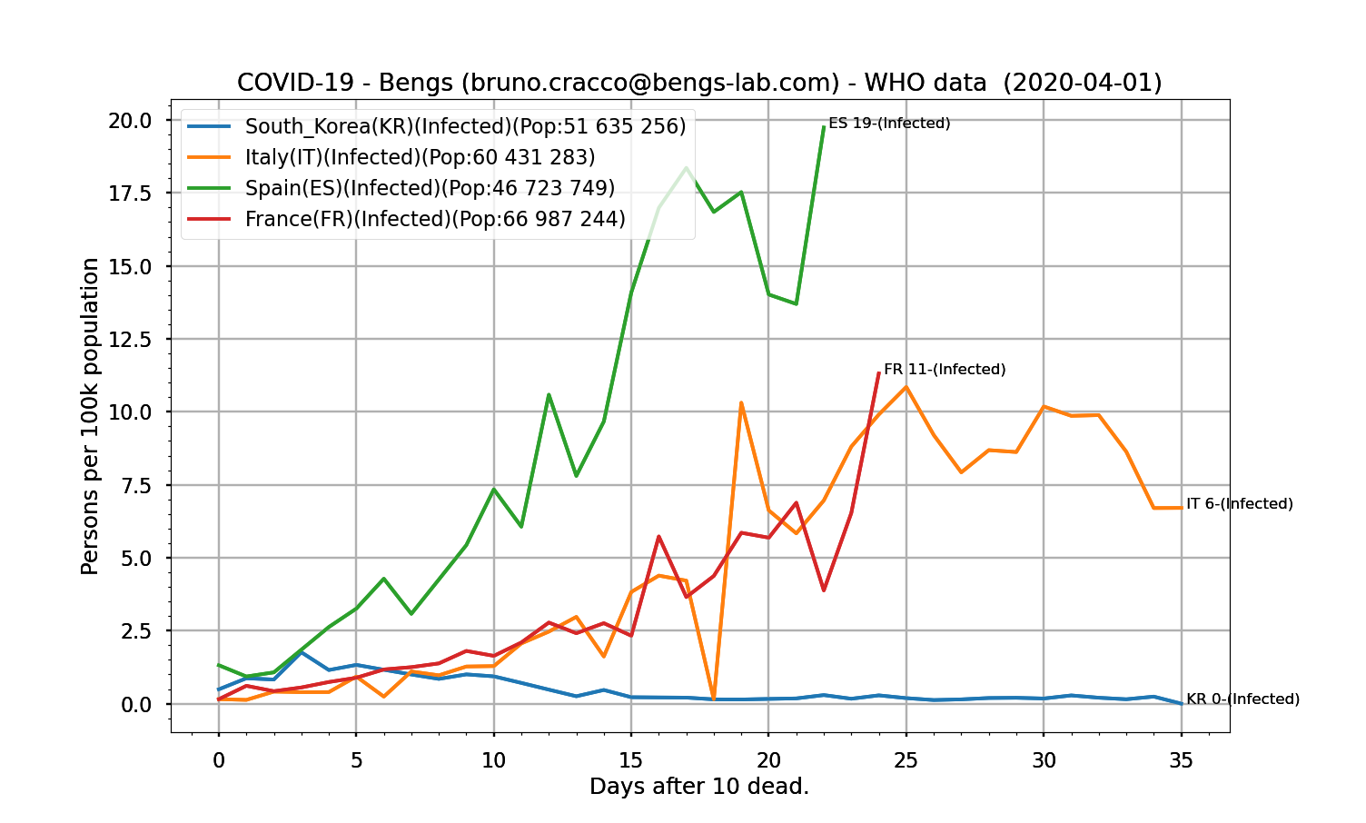
Fig. 7 : curves for France, Spain, Italy and South Korea of the number of people testing positive per 100,000 of the area’s population as a function of the number of days since the 10th death – logarithmic scales – unfiltered
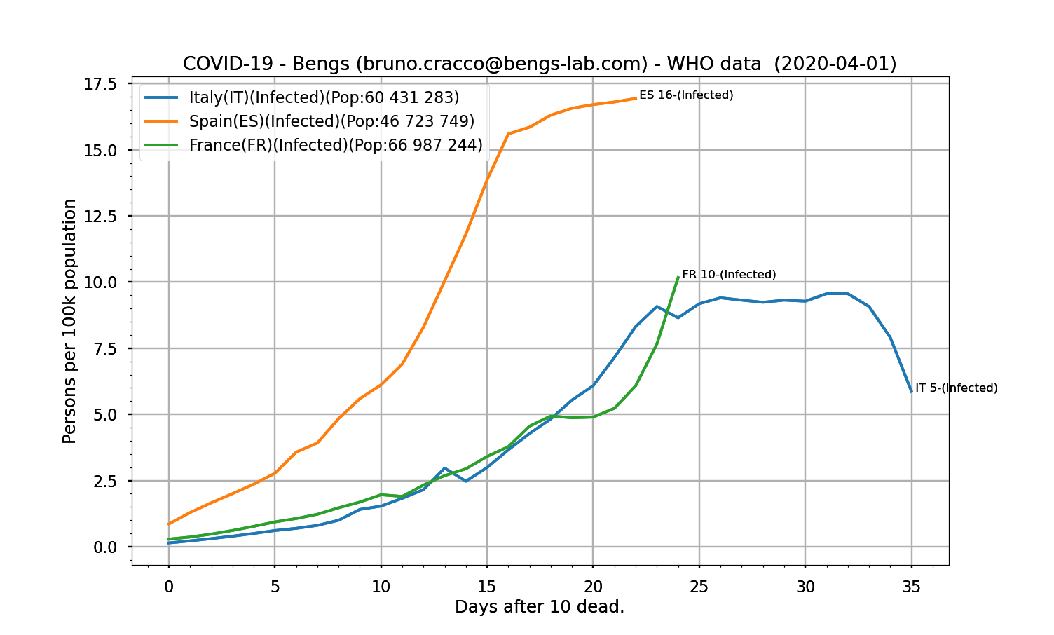
The trend continues for Italy, but not at all for Spain and France. But wouldn’t it have been possible to see this inflection before it was so visible?
Changing the mode of representation to hope to understand something of the situation
The only way to find out what is really happening on the pandemic front is to analyse the number of infections over a period of time and relate it to the total number of people infected at the same time. Indeed, if the contagion is not under control, the number of new contaminations by infected people remains constant. So the number of new contaminations continues to increase exponentially. On the other hand, if the measures taken (social distancing, individual protection, containment, even vaccination later) make it possible to stop the phenomenon of the spread of the disease, this can only be seen by analysing the evolution of the ratio of new contaminations / total contaminations.
This ratio is close to R-0 (average number of new contaminations by an infected person), i.e. between 1 and 4 for covid-19 disease. However, the numbers involved are thousands or even millions of people. Logarithmic scales must be used. The logarithmic scale presents proportional values as a line, exponential phenomena as a line whose inclination gives the factor. This gives a plot that is easier to interpret than an exponential one.
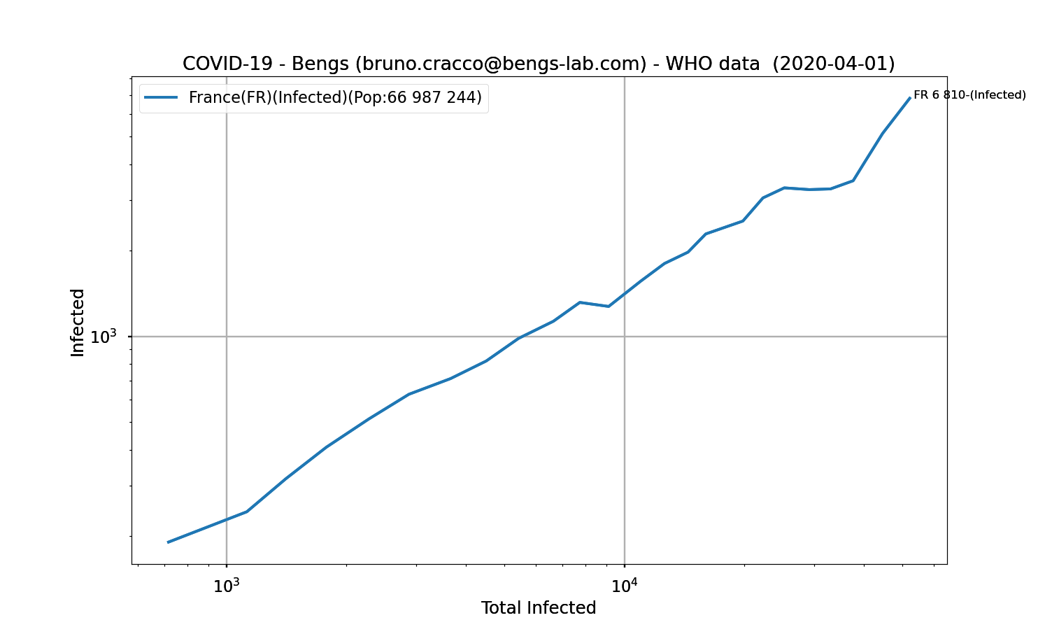
Fig. 9: Number of new positive cases as a function of the number of people testing positive, logarithmic scale, Savitzky-Golay filtering
We can see on this curve that during a period ranging from 1,000 to 20,000 cases of contamination, the disease progresses smoothly because the line is straight, so the rate of contamination is standard, in line with the R-0 of Covid-19 disease. But from about 20,000 cases onwards, the curve bends. This means that those who are infected contaminate healthy people less quickly. Which is good news. But, it rises sharply, which brings us to the alerts of the health authorities who repeat over and over again that the worst is ahead of us.
If you look at South Korea, whose control of the epidemic is praised, the drop in the curve is very clear.
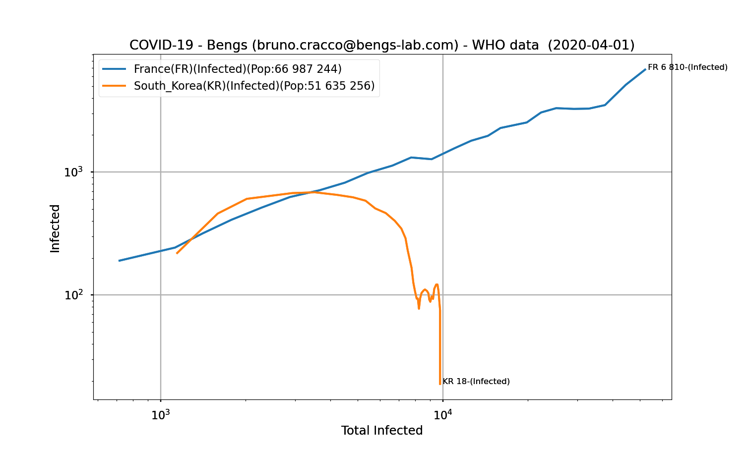
Fig. 10: Number of new positive cases for France and South Korea as a function of the number of people testing positive, logarithmic scale, Savitzky-Golay filtering
At about 3000 recorded cases of contamination, the curve decreases, contaminated people no longer contaminate healthy people. The epidemic has been stopped in South Korea.
What about it then ?
This figure shows the curves for a few countries that have resorted to containment, more or less quickly. First by plotting the number of contaminated cases as a function of time, since the 10th death.
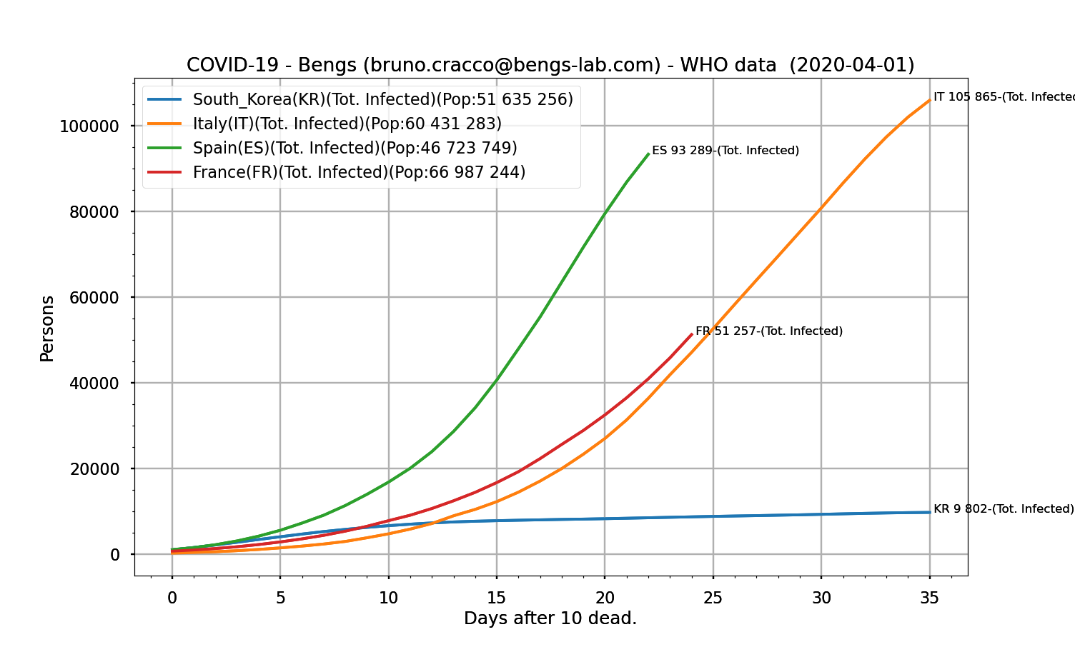
It’s hard to tell how the patient’s doing. Especially since the number of cases detected depends on the detection methods adopted by the country. Spain seems to be doing better because the slope is less steep. As far as Italy and France are concerned, it is difficult to say so.
Yet, as we have seen, Italy’s daily contamination curve is clearly showing signs of improvement on the Covid-19 front.
Italy seems to be on the right track, Spain is experiencing a respite but the situation in France is not reassuring
If we take Italy and plot the logarithmic graph of new cases to total cases.
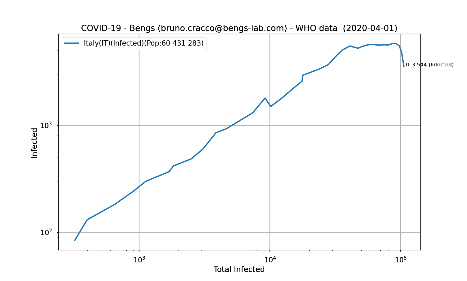
Fig. 12: Logarithmic graph of Italy, filtering
There is a stall to the right from about 40,000 cases. This corresponds to the date of 19 March 2020. Where were we on the daily contamination curve on that date?
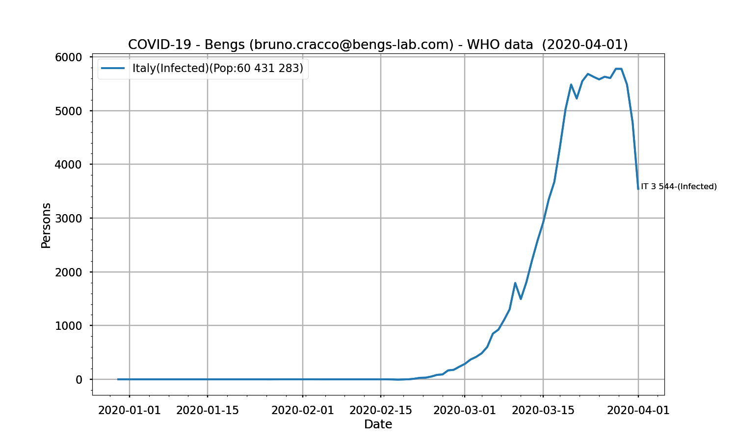
Fig. 13: Evolution of the number of daily positive cases as a function of date
On 19 March, Italy reported 4207 new cases, then on 20 March, 5322, then more than 5900 on 21 until peaking at 6557 on 29 March. If we look at the curve, on that date the number of daily contaminations was even accelerating. The fight could seem to be turning in favour of the virus, and render the measures taken then futile.
However, the stall was visible from 19 March onwards thanks to this logarithmic representation.
If we take our close countries that had implemented containment, we obtain the following logarithmic graphs.
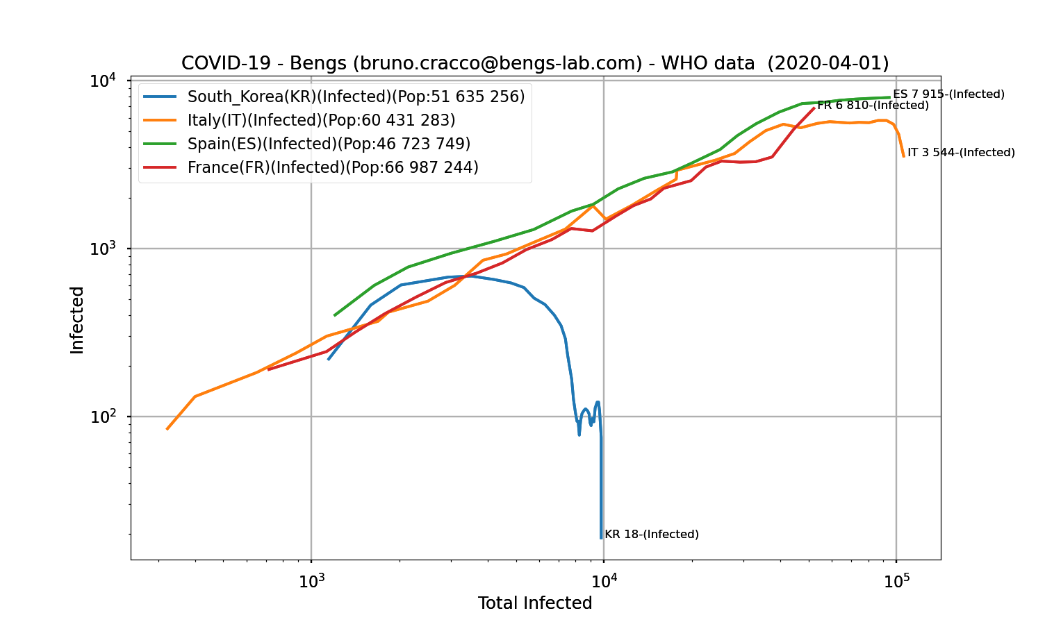
Fig. 14: Logarithmic graph of France, Italy, Spain and South Korea, filtering.
Spain and Italy seem to be on the right track with a marked drop for Italy, timid for Spain. As for France, it is not so good for the moment even if we note a stall from about 22300 contaminated. It is the date of March 24 which corresponds to this total number of contaminations.
Are the containment measures having an effect?
What about countries that have been slow to implement containment measures to reduce the progression of the disease?
Here is the logarithmic graph comparing the USA, Italy and France.
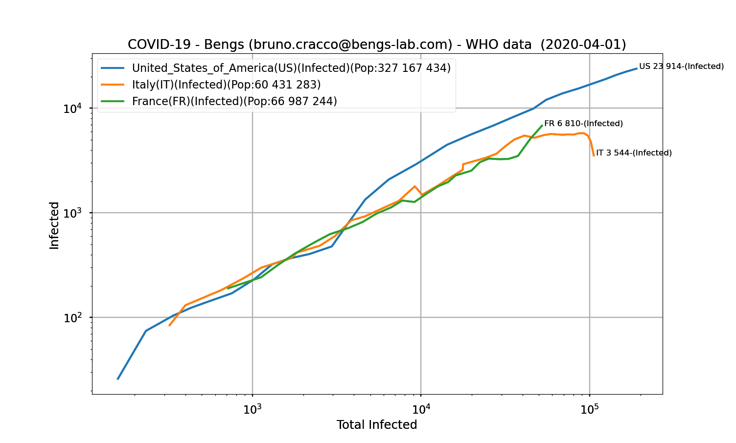
Fig. 16: Logarithmic graph of the United States, Italy and France, filtering
It is immediately noticeable that the curve for the United States is much higher than that of France and Italy from around 4,000 contaminations onwards. This means that the number of contaminations of healthy people is much higher for each proven case.
The very recent turnaround in the United States could produce results in hopefully 6 to 10 days, which we will watch closely on the curves.
Is it possible that China is providing false figures on the epidemic ?
That leaves China. The controversy swells over the reality of the figures given by China when the epidemic was raging in their country.
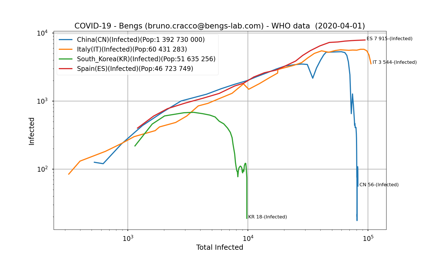
A quick glance at the logarithmic graph comparing the situations in China, South Korea and Italy does not cast doubt on the accuracy of the contamination figures. The curve is well aligned with the others, reflecting an identical R-0 of the SARS-CoV-2. On the contamination itself, there were no measurement “errors”.
What about the mortality of the disease?
This graph shows the total number of deaths since the 100th death as a function of the total number of infected persons
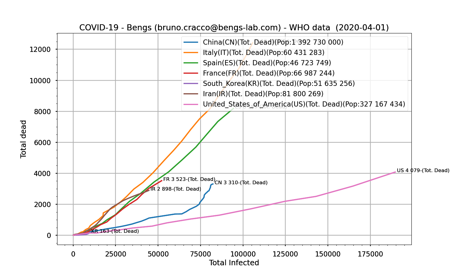
Fig. 18: Number of infected persons as a function of the number of infected persons
In view of these curves, one can say that Chinese medicine is more effective than European medicine and that it competes with American medicine, which seems to contain the fatal cases of Covid-19 in the same way.
But to be complete, one must take into account that there is a delay between the detection of an individual’s contamination and possible complications that could lead to death. The speed at which the epidemic develops must therefore be taken into account to put the quality of care into perspective.
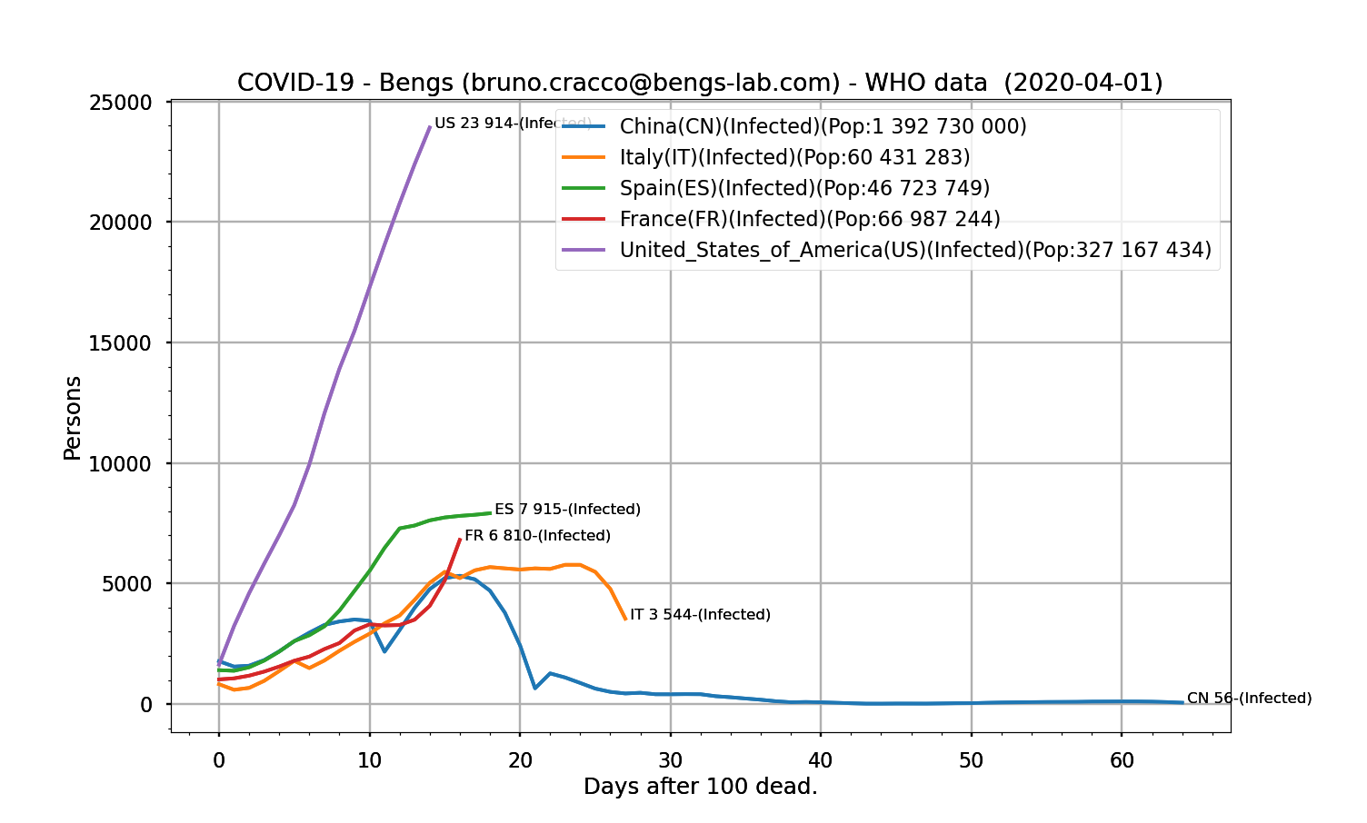
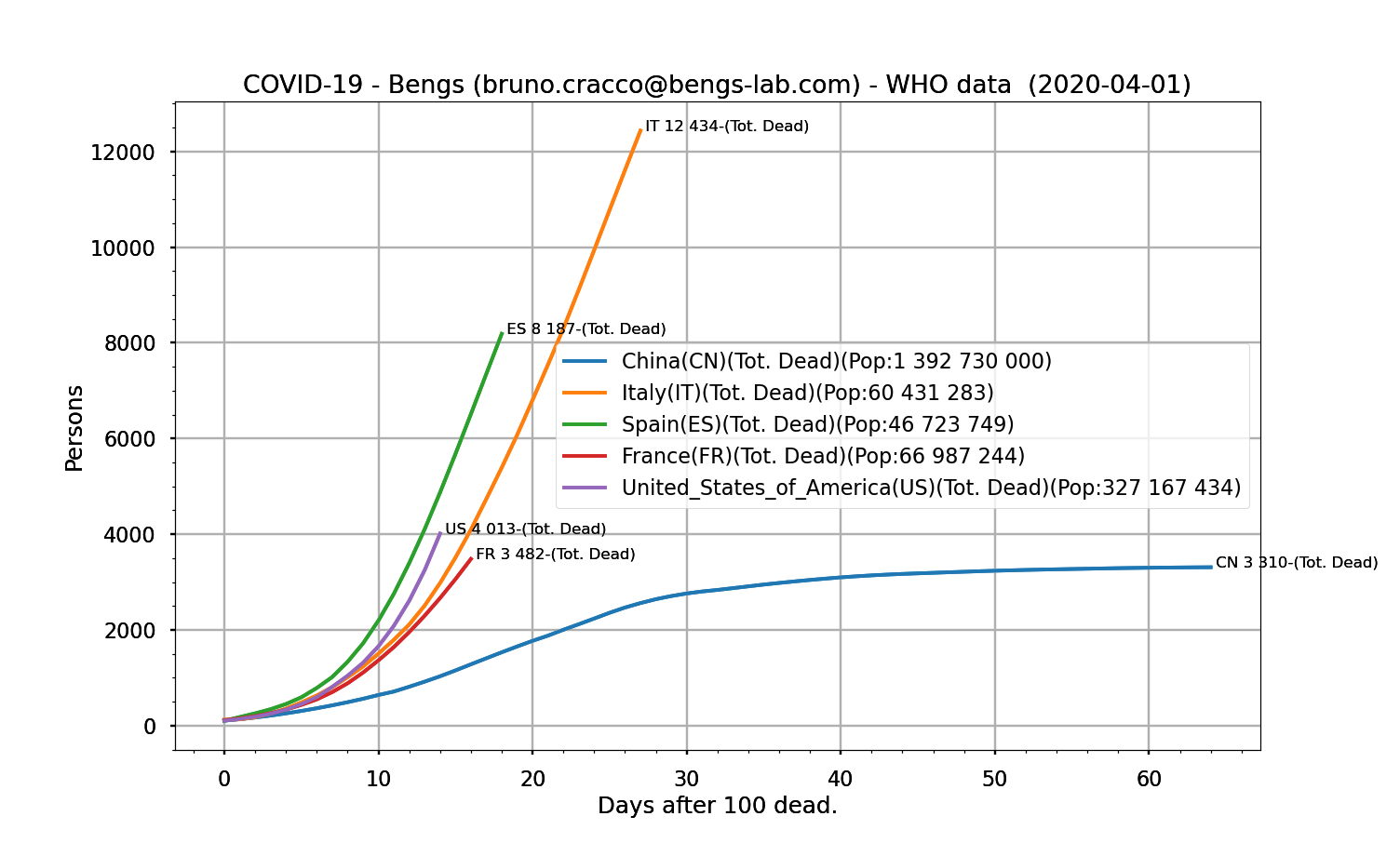
Fig. 20: Total number of infected persons as a function of the number of days after the 100th death.
These curves show that China’s contagion rate has been very similar to that of other countries, particularly European countries. However, the death rate as a function of the number of cases of contamination is much lower than in Europe. One may therefore wonder about the method of counting deaths or about possible errors.
The evolution of rates in the USA will give us some clues to assess whether the Chinese scenario is confirmed. Stay tuned!
Although we took great care in interpreting those data, it represents a point of view of Bengs at a certain time.