The day before yesterday, President Macron announced an extension of the containment measures until 11 May. At that time, a gradual deconfinement will take place, taking us to the beginning of September, or even a little later.
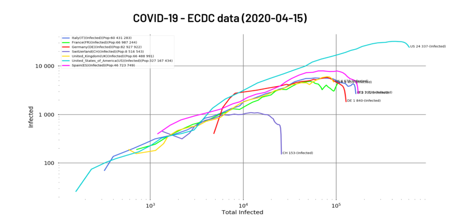
On the front line of the epidemic’s progress, the news is rather reassuring. If you look at our exponentials, it’s still rising.
Fig. 1: Total number of people positive for the virus as of 15/04/2020 for Italy, France, Germany, Switzerland, United Kingdom, United States and Spain. Logarithmic scales, filtering
Numbers continue to grow, but the fight is turning to the advantage of the medical profession
Plotting a double logarithmic scale graph of the new cases versus the total number of cases gives a more reassuring picture of the situation.
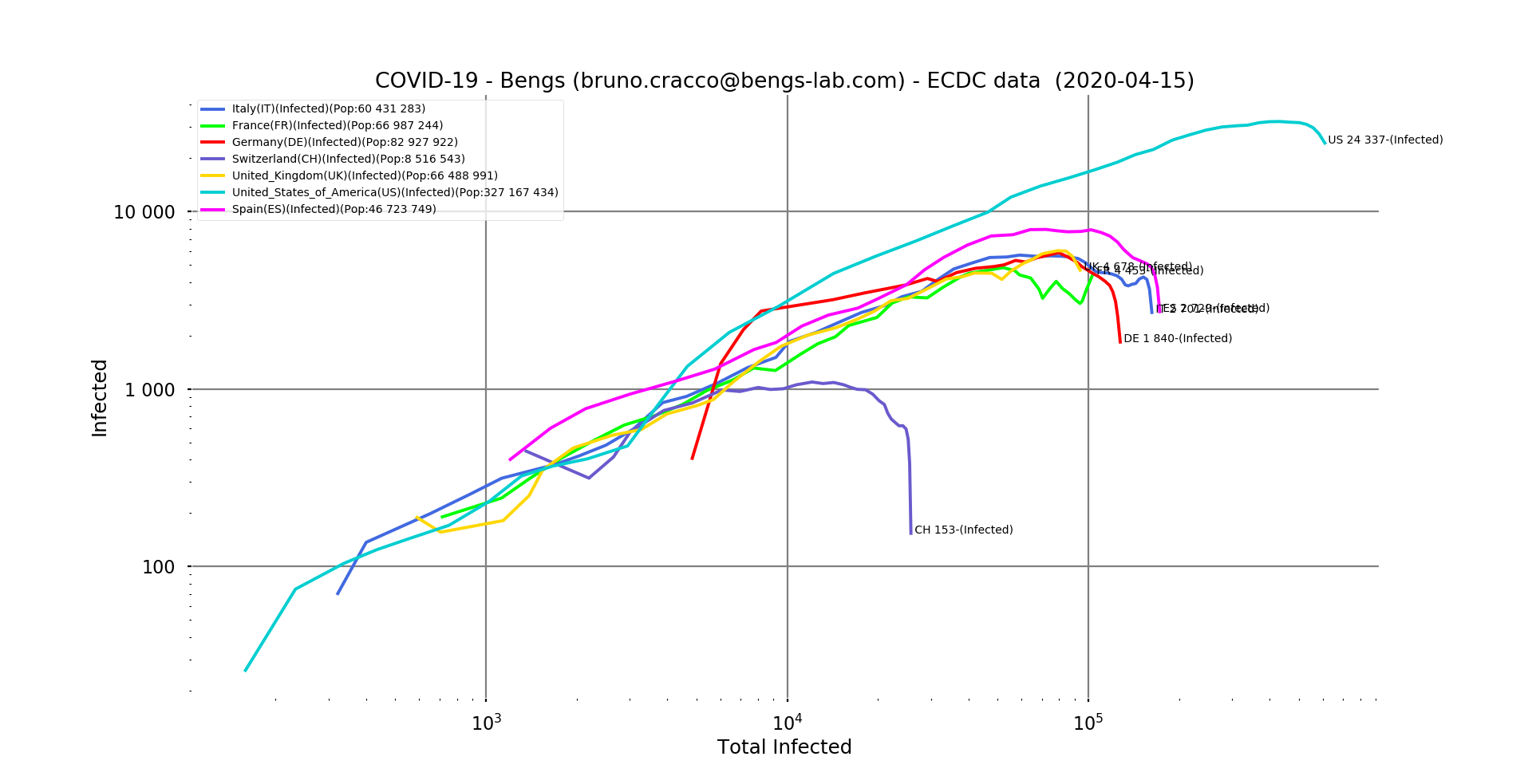
Fig. 2: Number of new positive cases of the virus in relation to the total number of cases reported as of 15/04/2020 for Italy, France, Germany, Switzerland, United Kingdom, United States and Spain. Logarithmic scale, filtering
We can clearly see that almost everyone seems to be winning the fight against the geometric progression of the epidemic. France has been oscillating between control and recovery for several days now. At the same time, the news coming from hospitals is reassuring since the number of patients admitted to intensive care is falling day by day.
Containment measures therefore seem to be bearing fruit in all the countries that have implemented them, albeit more or less quickly. Even the United States seems to be on the way to a timid recovery, even if the values are very high.
This trend can also be seen in the non-logarithmic curves showing the differences in proportions between the United States and the countries of Europe. Even Spain, which has been very hard hit, is very far from the US scores. The daily number of new infections in the USA is 2.5 times higher than the maximum in Spain. And again, with epidemics spreading from one country to another, the size of the country doesn’t really matter. The population density where the outbreaks occur, on the other hand, is very important. The higher the density, the greater the number of daily interactions of each infected person (which constitutes a mobile outbreak) with healthy people. Imagine if the virus could have been seen in the subways of Paris or New York! This is why the biggest outbreaks are of course located in the densely populated areas of the affected countries. The North for Italy, Madrid and Barcelona for Spain or the Paris region for France and of course New York in the USA.
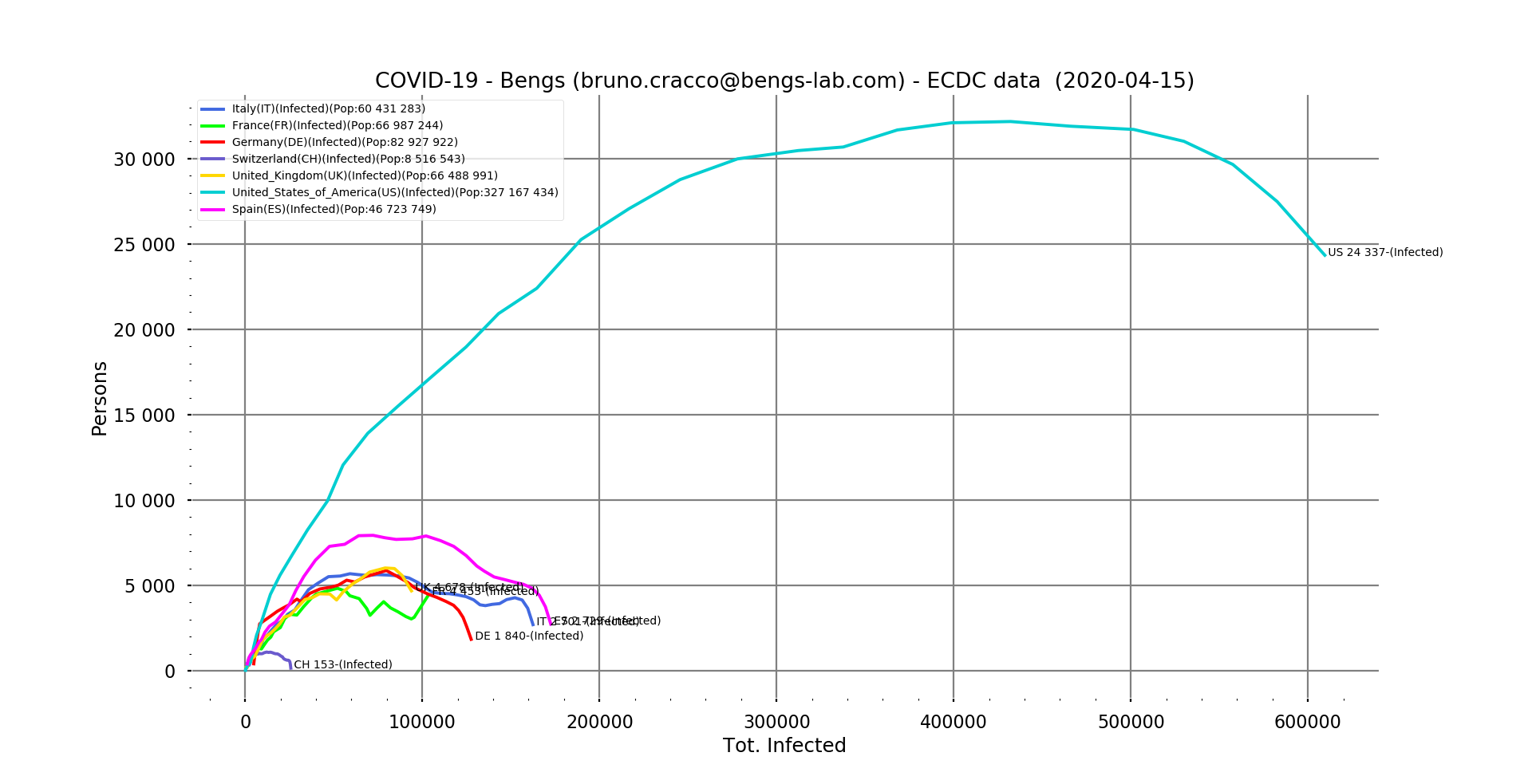
Fig. 3: Number of new positive cases of the virus in relation to the total number of cases reported as of 15/04/2020 for Italy, France, Germany, Switzerland, United Kingdom, United States and Spain. Linear scale, filtering
What about the mortality of the disease?
The mortality rate of the disease remains a mystery. Without sufficient hindsight, it is unknown for the moment. As I said in a previous note, while its calculation is simple once we know definitively the number of deaths and the number of people who have contracted the disease, obtaining these numbers is extremely complicated. Indeed, in the absence of a standard to take into account one death (co-morbidity means two simultaneous causes, which one is retained?), and of systematic screening to measure the number of people affected, no ratio, no mortality rate in the absolute. If we add to this the effect of care (does a well-cared-for person survive, would he or she have survived without care?), we can say that we are not close to knowing.
On the other hand, within a given perimeter, say a country, if both counting systems are stable and the quality of care also remains constant because the health system can cope and offer the same level of quality of care to everyone, we can establish a contextual mortality rate and measure its evolution over time. The delay effect due to intensive care can last for several weeks before the patient dies, causing the patient to rise for several weeks and then stabilize. We have seen it in China, it has been established at 4% and then remains very stable.
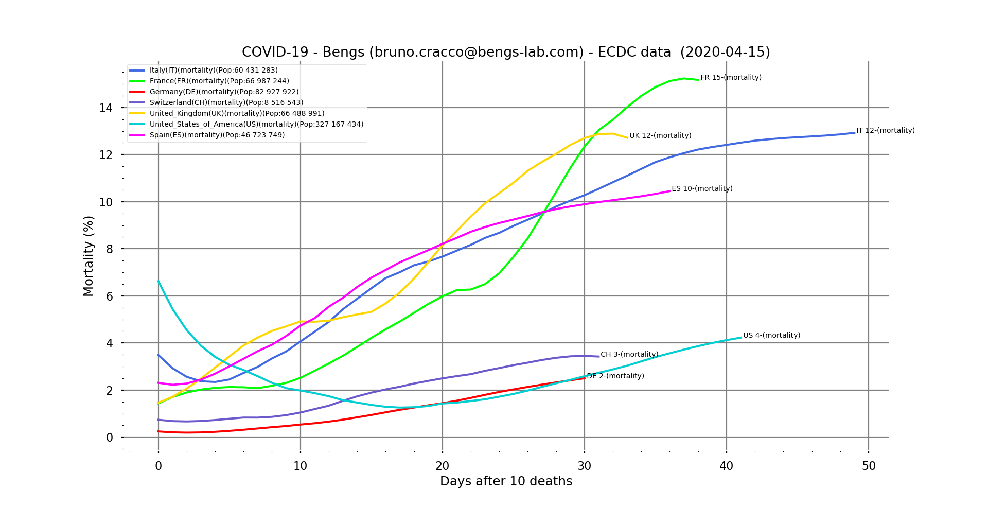
Fig. 4: Contextual mortality vs. days after the tenth death for our usual sample (Italy, France, Germany, Switzerland, UK, USA and Spain), filtered.
Rates in Europe seem to be stabilising. We had predicted 13% for Italy a week ago, it seems to be the case, although it is still rising a little bit. Spain, on the other hand, is ahead of the 10% forecast at 10.5% and still seems to be on the rise. In France, it seems to be moving towards 15.4%. It is reassuring to see it stabilising, as this means that the quality of care is not deteriorating and even that more cases are now being saved. The arrival of an effective remedy will make it possible to bring it down drastically. But we are not there yet.
The United States is atypical. The rate is quite low (again, it depends on the way we count so we should not take it in absolute terms or compare it with other countries) but it started at 7% and then dropped to less than 2% and has been rising since then in a linear way. Let’s hope that a saturation of the health system does not make it increase significantly, because given the number of cases recorded, it can cause a lot of deaths in the end.
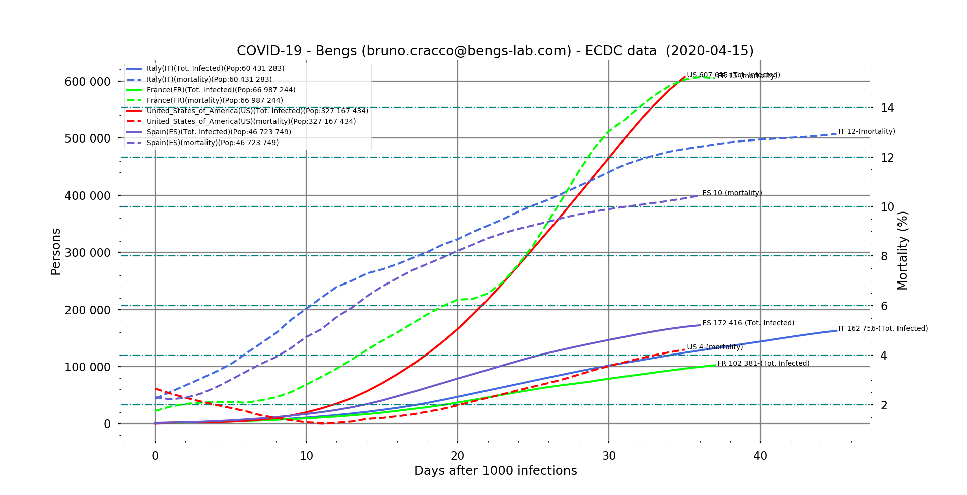
Fig. 5 : evolution of mortality and number of cases in Italy, France and USA after the 1000th case of contamination.
According to what we have seen in Italy, the rate took about 45 days after the 1000th case of contamination to stabilize. This is the order of magnitude we found with China (52nd day after the 1000th case, 55th after the 10th death). If we pay particular attention to the profile of the curve, we see that on the 12th or 13th day, we note an inflection. This may be related to the saturation of the health system in northern Italy before this inflection, which led to the decision to confine the case on 9 March, 9 days after the 1000th case.
But the question is how high it will go in the USA. According to the Italian profile, it will take at least ten more days for the American rate to stabilize (there is no sign of inflection for the moment). At this rate, if it does not grow as spectacularly as in France (which is actually due to a change in the method of counting deaths in France with the census of cases and deaths in EHPAD), it should at least rise to more than 5%. With more than 600,000 cases registered at the time of writing, projected in 10 days time to around 880,000 cases, that makes a death toll of 44,000 at that time. By the way, if we do the same exercise with France (mortality rate stabilized at 15.4% and about 132,000 cases in 10 days) we arrive at a death toll of nearly 20,000 on April 26.
Another unknown of this virus is its R-0 (average number of contaminations per contagious person)
Calculating the R-0 of SARS-COV-2 is very complicated at this point. Indeed, it is extremely dependent on the density and social uses of the populations but also on the completeness of the detections. SARS-COV-2 is extremely effective. Many carriers are not even symptomatic, it has a fairly long incubation period during which it is contagious, and it seems to survive well on the surfaces around us. In short, its survival system seems to be particularly successful. The highly tactile Latin civilisations and the density of urban centres in Southern Europe provide a perfect breeding ground for this strategy. And we can see this with the scores achieved in Italy, Spain and France. The containment measures decided by governments aim to modify risky social behaviour to limit the spread of the virus in dense areas. And it seems to be bearing fruit, as we saw at the beginning of this note. As with the mortality rate, we can establish a local R-0 and observe its evolution. This R-0 is mathematically the reason for the geometric sequence that the number of contaminations follows irremediably, and which gives us these exponential curves that we all know now. We can calculate it of course.
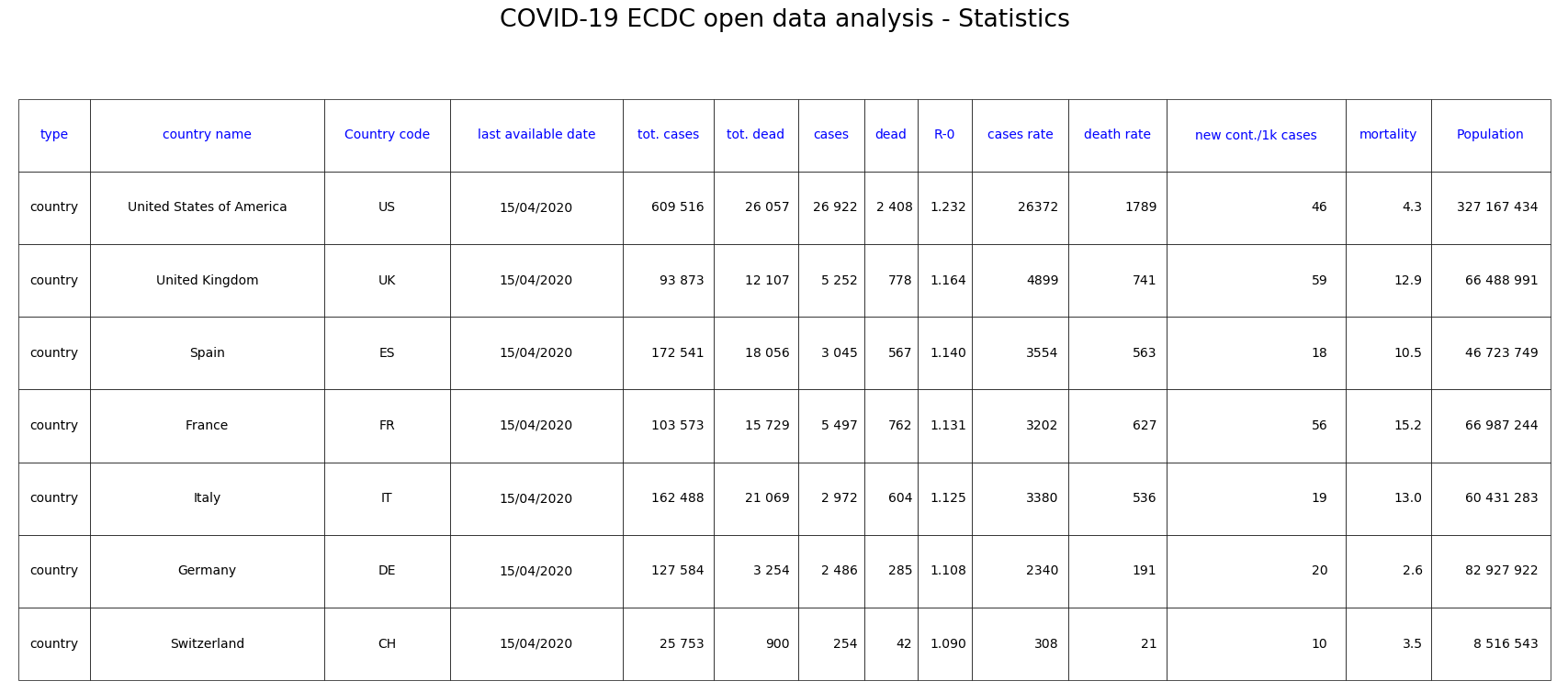
Fig. 6: Statistics of countries in our sample classified by decreasing R-0.
This calculated R0 is the exponent of the measured exponential curve. It is between 1.09 for Switzerland and 1.23 in the USA. By way of comparison, the R-0 for seasonal influenza is between 1.5 and 3 without any special measures.
Here is the list of the 10 countries with the highest apparent R-0. These are the countries with the steepest exponentials, of course.
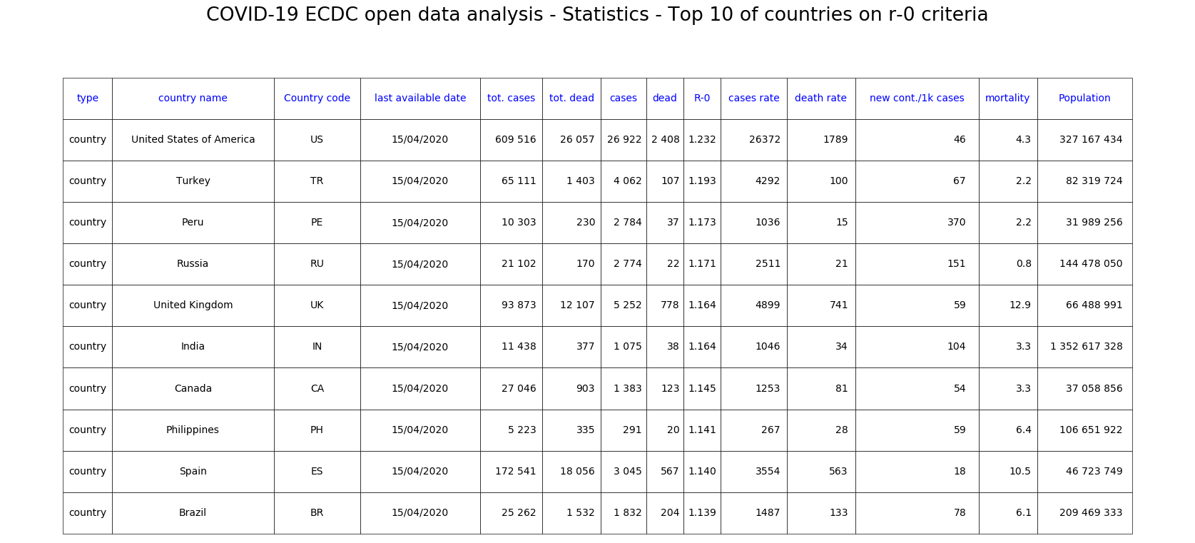
Fig. 7: Top 10 countries ranked by R-0 decreasing.
Ces comportements sociaux expliquent-ils l’incroyable résistance des pays nordiques ?
Because there is a special case with the Nordic countries.
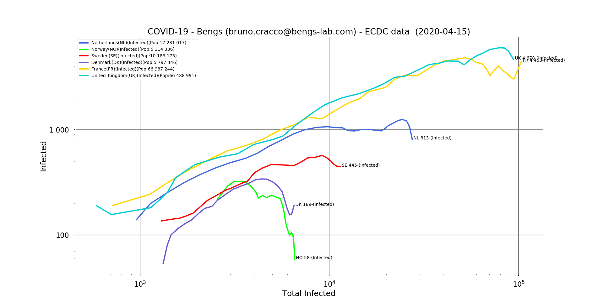
ig. 8: double logarithmic scale graph of Sweden, Denmark, the Netherlands and Norway, with France and the UK for comparison.
All have very quickly brought the epidemic under control and kept it at very low levels.
And, of course, there have been very few Covid-19 deaths…
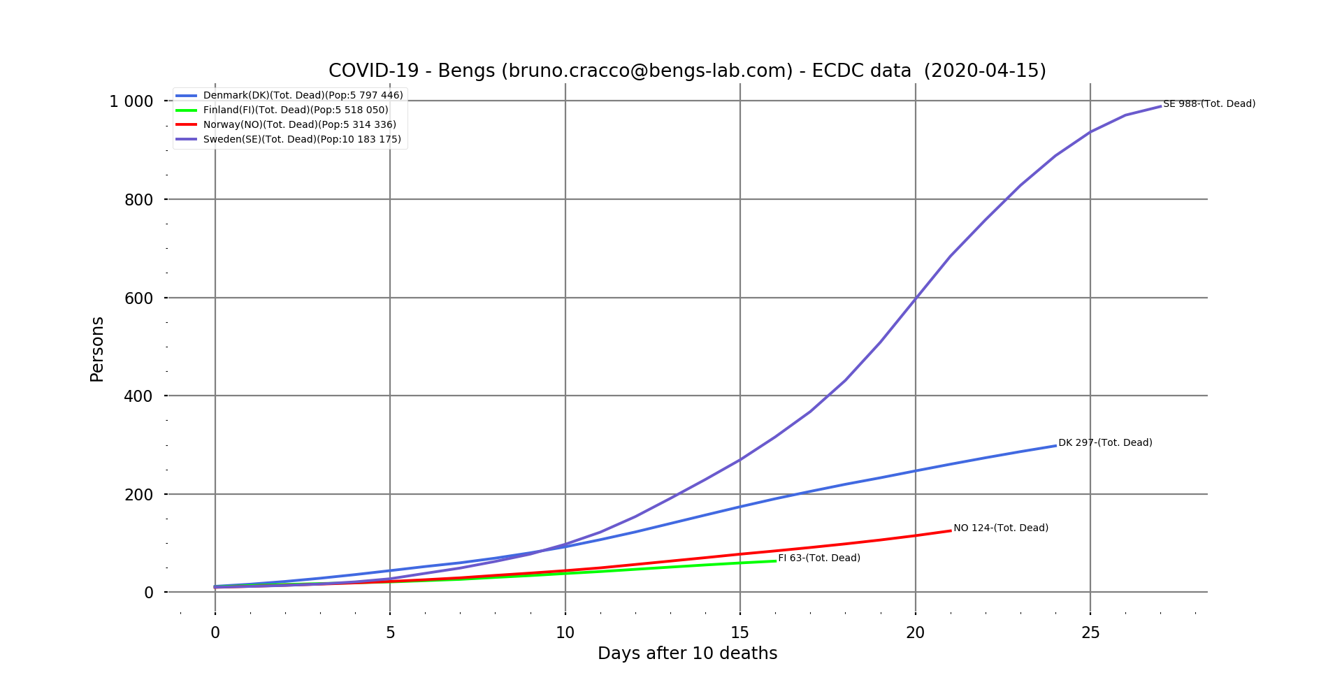
Fig. 9: Line graph of the number of deaths in Sweden, Denmark, Finland and Norway as a function of the number of days after the 10th death.
Our exponential numbers are still there, but at much lower levels, since Sweden, ahead of the others, has 988 deaths.
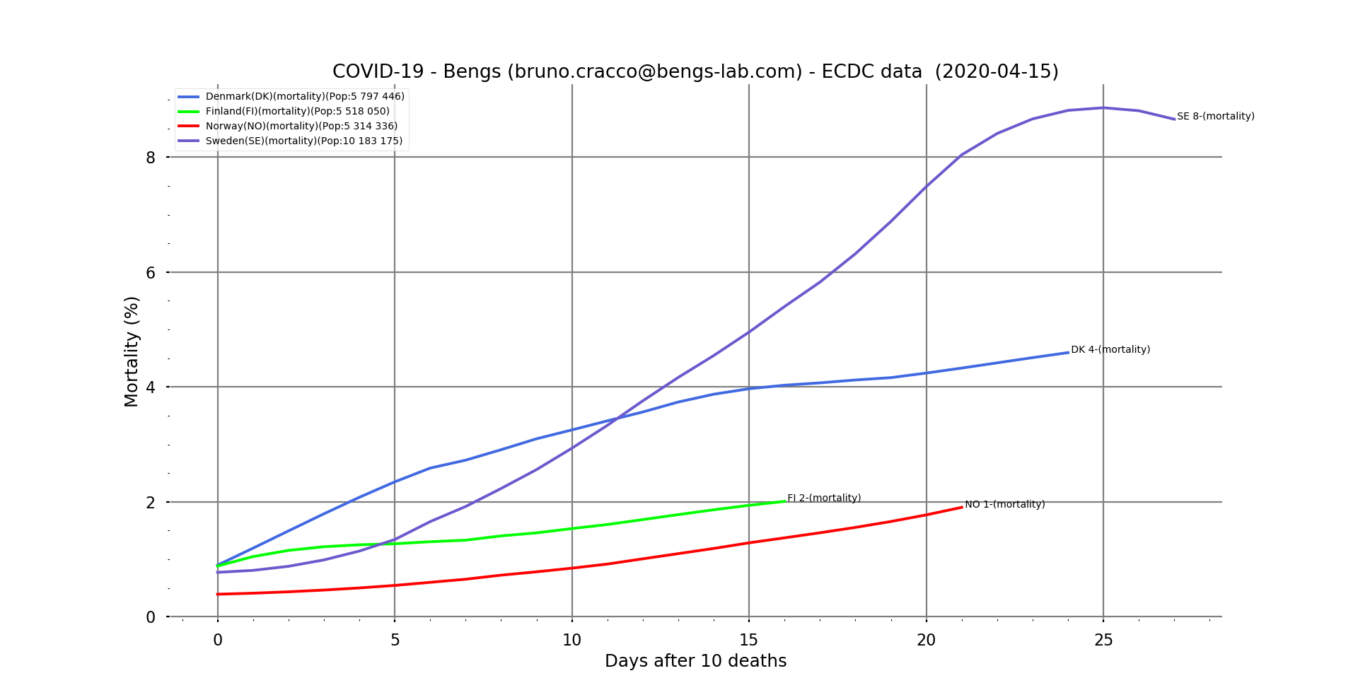
Fig. 10: Line graph of apparent mortality in Sweden, Denmark, Finland and Norway as a function of the number of days after the 10th death.
We note on the mortality curves that Sweden seems to be in control of the mortality rate probably because it is the country with the most cases, and about ten days ahead of the others in the progression of the epidemic…
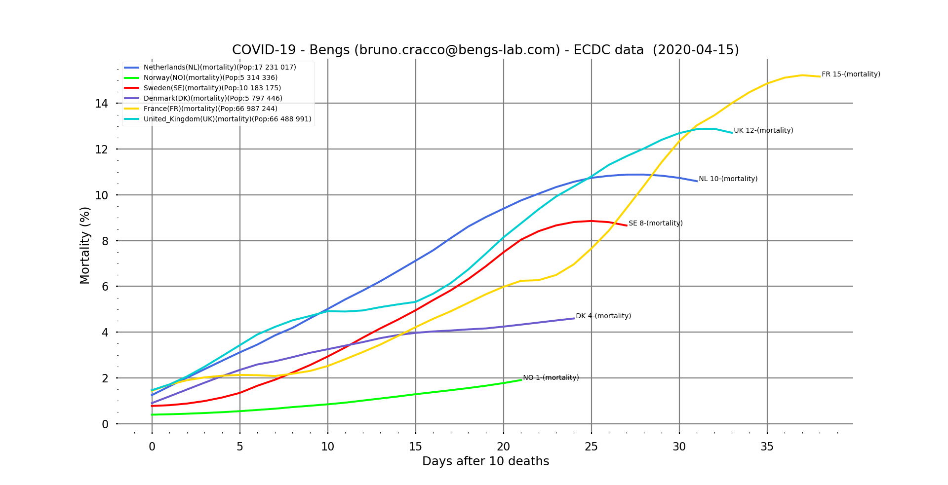
Fig. 11: Contextual mortality rate on a linear scale for the Nordic countries, with France and the UK as reference and as a function of the number of days after the 10th death. Filtering
This graph clearly shows the gap between countries in terms of the arrival of the epidemic.
This phenomenon appears on this animation of the evolution of the number of new cases per country as a function of the date.